Optimised customer portals – an undervalued asset
Optimised customer portals – an undervalued asset

Across industries and sectors, most brands’ user interfaces now include an online customer portal. In a world where paper-free documents are becoming the norm and internet users are increasingly self-sufficient, these portals are no longer an added extra, but a must. And yet the user journey on some portals is still far from ideal.
One portal, many opportunities
The main goal of customer portals is to foster customer loyalty. Users will judge a company’s dedication to its customers by how easy their portal is to use. In your opinion, what will a user think if they have to spend 260 seconds finding out how to change their billing address? Dedication to your customers is all the more important given how easy it is to simply switch to the competition.
In sectors where switching providers has historically been difficult, such as banking and insurance, telecoms, and energy suppliers, many companies now allow customers to sign up in less than 10 minutes. Can you blame a frustrated user for checking out the competition?
Another aim of portals is to simplify customer relations. Portals provide customers with quick access to the information they’re looking for (such as order history, bills, account details, complaints, and so on). If a portal is truly seamless, it will ease pressure on customer management. This will free up your phone channels for higher value added activities, like sales advice.
On the other hand, a portal that doesn’t meet customer expectations will mean overloaded call centres, increased risk of losing customers to competitors, and fewer sales from existing customers. You do the maths.

ROI of your customer strategy
A lot of brands are no longer making this mistake, but in the past, many allocated a significant proportion of their budget to customer acquisition – at the expense of customer retention. In fact, in the 2000s, brands spent around five times as much on acquisition as on retention (source).
Nowadays, the split tends to be more equal, with increased budget for customer care and customer loyalty. Many companies have realised that retention is just as important as acquisition, and is often cheaper:
- Increasing customer retention by 5% can increase profits by 25-95%, depending on the industry (Journal of Management Studies)
- On average, 80% of a company’s turnover comes from 20% of its client base, in other words, from their loyal, satisfied customers (source)
- In e-commerce, the average value of a new customer’s shopping basket is more than double that of an existing customer ($24.50 versus $52.50) (McKinsey & Company).
Listening to and pampering your customers is a cost-efficient strategy.
Involving your customers
Though customer portals aren’t visible to the general public, for brands, the stakes are extremely high. For this reason, the various elements that make up the portal need to be taken seriously.
Understanding the importance of these portals will help those in charge ask the right questions – is the user journey seamless? Are the elements easy to understand? Are the functionalities relevant?
User testing is an invaluable method for reflecting on and optimising the user journey. Our mantra is, “Who better to give feedback on your portal than your customers?”
We can already hear you saying, “OK then, but how are you going to find my customers?”
The Testapic panel (300,000+ testers) is representative of European internet users. This means we can easily identify customers of well-known brands. We’ve conducted testing on customer portals for brands such as Decathlon, Peugeot, AXA, and Europcar.
When it comes to smaller audiences, we can contact your customer base directly and provide them with a link to the test.
In addition to customers, it is also a good idea to ask leads to take part in testing – they’re your future customers after all. All the more reason to engage with them early and make a good impression when they first log in.

Optimising the user journey
Here too, we can hear you saying, “When should I talk to my customers about an online portal?”
Well, we have the answer to that too. When you work with Testapic, you can also run tests based on a model, or mocked-up portal. Many of our clients have asked us to be involved in the early stages of creating or redesigning their user interfaces to help find out what their customers want and expect from a portal.
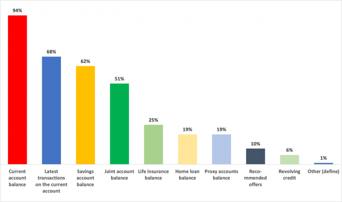
In a Mobile application like this, what do you think is the most important information to display first?

(Exploratory test with 150 users, on a customer portal for a banking and insurance client)
We’ve also conducted many tests with B2C and B2B clients on online portals (simple portals or self-service portals) within existing user interfaces (website, mobile site, or mobile app). In these cases, clients wanted to evaluate either the user journey or specific pages in the portal (such as account creation, changing details, looking for bills, managing settings, etc.)
Here are a few examples of instructions given to users within different tests:
- You want to download your latest consumption report. What do you do when you arrive on this page?
- Without clicking on anything, what service do you think this site offers?
- At the end of this journey, would you say the navigation was intuitive? Completely agree/Somewhat agree/Neutral/Disagree/Completely disagree)
- Download and open this Mobile application. In your opinion, does the menu seem: Clear/Cluttered/Modern/Dull, etc.
Now you know how easy it is to get feedback from those using your website or app every day – no more excuses!
We can’t say it enough: listen to your users!
 Published by : Julien Hennig - Categorised in: UI / UX (Design & Conception)UI / UX (Design & Conception)

